
4 flower bouquets 4 strikingly different compositions
To Each their own…..
There are many style elements when talking about floral design: color palette, vessel type, seasonal, local, or foraged versus internationally sourced, and composition to name a few. Below I explore four different styles of bouquets all of which have a distinctly different approach to composition yet are equally striking.
The overall composition of an arrangement I find relates the most strongly to elemental theory. Elemental theory, in short, is how everything is composed of varying levels of qualities. Is it ethereal or dense? Is there movement or is it stagnant? Is there a sense of dynamic tension or is it simply soft?
Ultimately this affects the energy and feel of a piece. If there is a sense of spaciousness, naturally and literally, there is more air and light present in the arrangement. The petals and leaves will have more room to move and breathe. So will the eyes.
I find it fascinating because it’s these choices which culminate into what we associate as an aesthetic. These are the intentional choices of elements for the composition as they relate to tone, color, texture, weight, symmetry, asymmetry, spaciousness, etc. which are then perceived and experienced by the creator and viewer.
The image I share in the third bouquet is a perfect example of this. In contrast to the first example where it is more dense, earthy, and compact. There may be a feeling of abundance and that all is contained and it’s certainly a great way to showcase everything that may be growing in the garden.
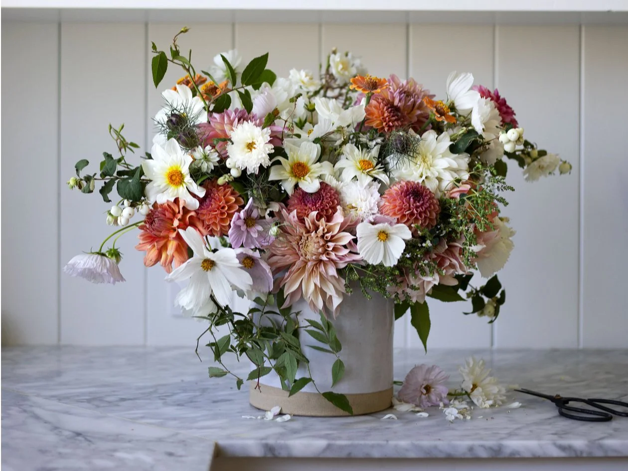
example 1: (photo cred: thegritandpolish.com)
With each example I’m going to highlight the elements I find that standout. I’ve deliberately chosen four very different composition styles so you can see and inevitably feel what you like and may want to explore in your own creations. Frankly, I love all of them in different ways. There are elements of each that I draw from as I continually explore and develop my own style.
Example 1: To me this is a homage to late summer in all her glory. It’s playful and happy. As I said above it’s also dense and compact. There’s not much movement and space between the cosmos, two dahlia varieties and zinnia blossoms. However what does break up the congestion and gives the composition balance are the green foliage elements. Using snowberry and flowering oregano adds both height, texture, and some movement as it drips down over the vessel.
Example 2: I personally love this composition. First, I love how it blends three very distinct yet harmonious things: the three white dahlias, the queen anne’s lace, and that vessel. I mean the color and shape are exquisite. It’s as much a part of the composition as the blossoms. Second, I like the asymmetry of movement happening. Some of the stems stretch to the left which is very natural. It captures how you’d see queen anne’s lace in the fields. Finally, I love its simplicity. I feel the same with food. You can have 2-3 ingredients and make the most stellar meal. More is not necessarily better.
Example 3: Dreamy, open, and wild. This example couldn’t be more opposite than the first. Where that one was compact showcasing the flowers themselves, this one uses the plants almost architecturally, defining the space itself by the stems, buds, and blossoms. The coral celosia is perfect. It has weight and substance and anchors the center. Because of the density at the center, the ethereal extension of the California pepper tree buds and rose hips works. Also stripping the leaves from the rose hips allows them to pop. The whole composition sparkles with color and texture
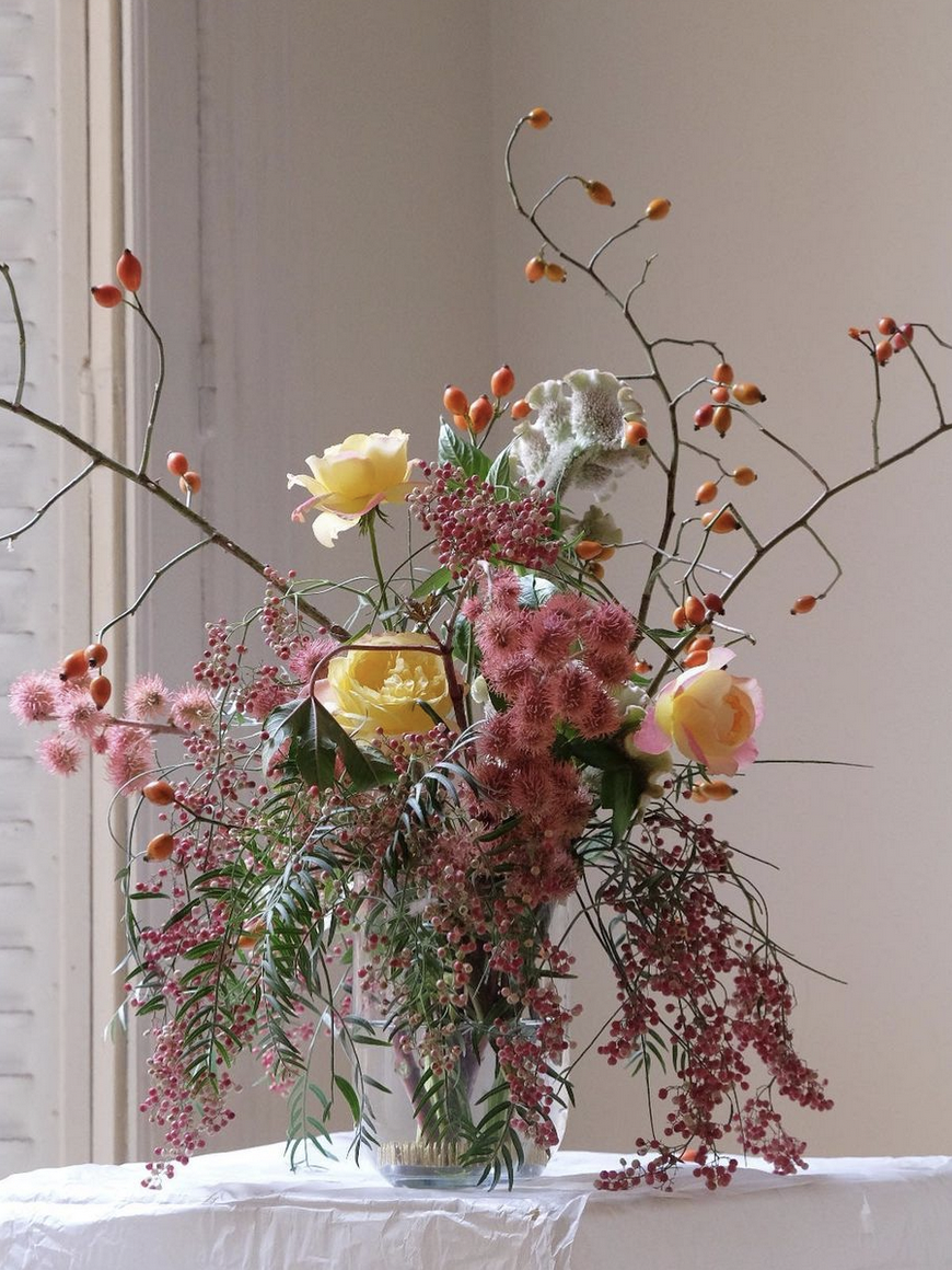
example 3 (photo cred: @saharaflowers)
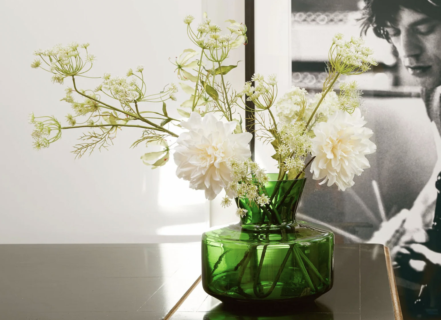
example 2 (photo cred: pomponamsterdam.com)
Example 4: In this example I wanted to share how using only one type of flower is still impressive. What you can explore like I did here is introduce a little tension by using one statement color and then just a touch of another. Or you could use the same color at different stages, meaning some budding, some open, and some maybe even beginning to fade. There’s also dynamic asymmetry in the overall composition based on the stem placement. They’re not all on the same visual plane creating a sense of movement. The colors also harmonize, an important factor for the eyes to gravitate and linger.
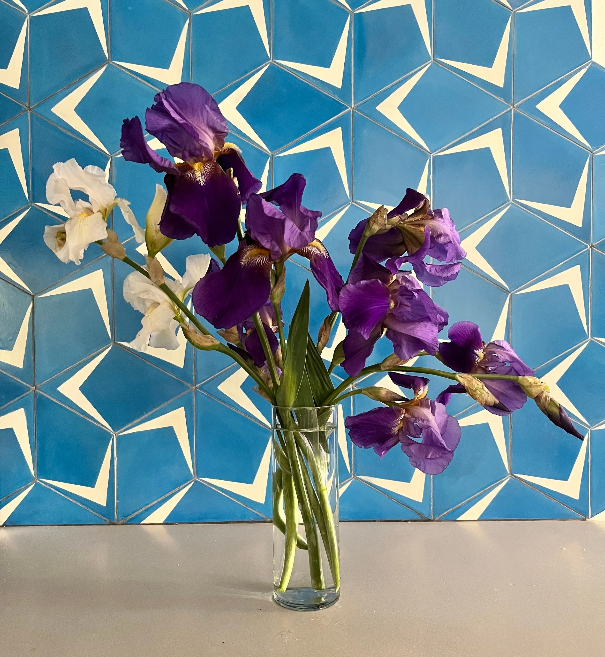
example 4 (photo cred: surroundlife.com)